flashlight.jpg

Dark Days

Dark Days

Project: MFA Type and Information Design Final
Length: 1 Semester

Tasks:
1) Draft a socially conscious editorial on a topic of your choosing and design a broadsheet for print.
2) Create a responsive web component to pair with the 4-page print layout.

About

The Dark Days Broadsheet and Website is a newspaper print and web experience dedicated to the stories of the homeless community inside NYC's tunnels during the 1990s. These folks, popularized as the 'mole people' developed an intricate underground shanty town, complete with running water and electricity.

This project is inspired by the documentary 'Dark Days' which chronicles these stories through film.
First Step

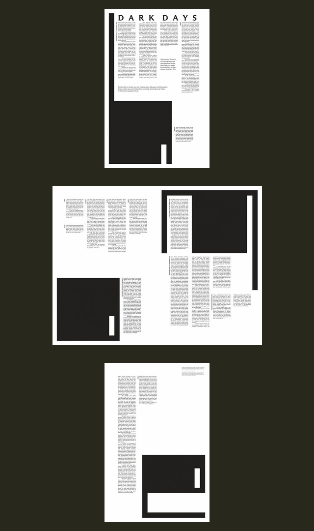
My first step for this project was to find relevant source material to develop into a broadsheet. I decided to focus on excerpts and direct quotes from tunnel dwellers about their day to day lives. I pulled these narratives from the documentary as well as first-person articles.

I juxtaposed these narratives with written statements by relevant social services, and the experiences of journalists documenting Freedom Tunnel.

Editorial Iterations

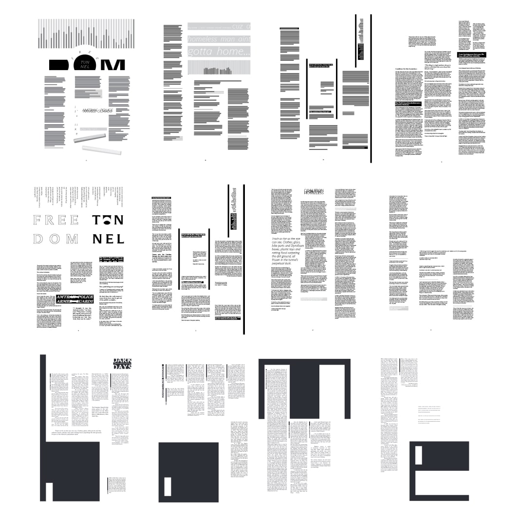
While the focus of this project revolved around layout design and developing a cohesive translation of content, I wanted to keep a strong graphic element, without direct use of pictures.

I achieved this through successive iterations, fine tuning drafts to create a bold but legible reading experience. Each page is dedicated to one large-scale background letter, forming 'h-o-m-e', defined in different ways by each viewpoint.

Final Version

The finalized broadsheet is single tone and consists of a four variable column grid. The work was published under Pratt jurisdiction at Linco Printing, in Brooklyn, NYC.

Website

The Dark Days website is a loose replica of the print broadsheet. The site is developed in a responsive four column grid for viewing across devices.

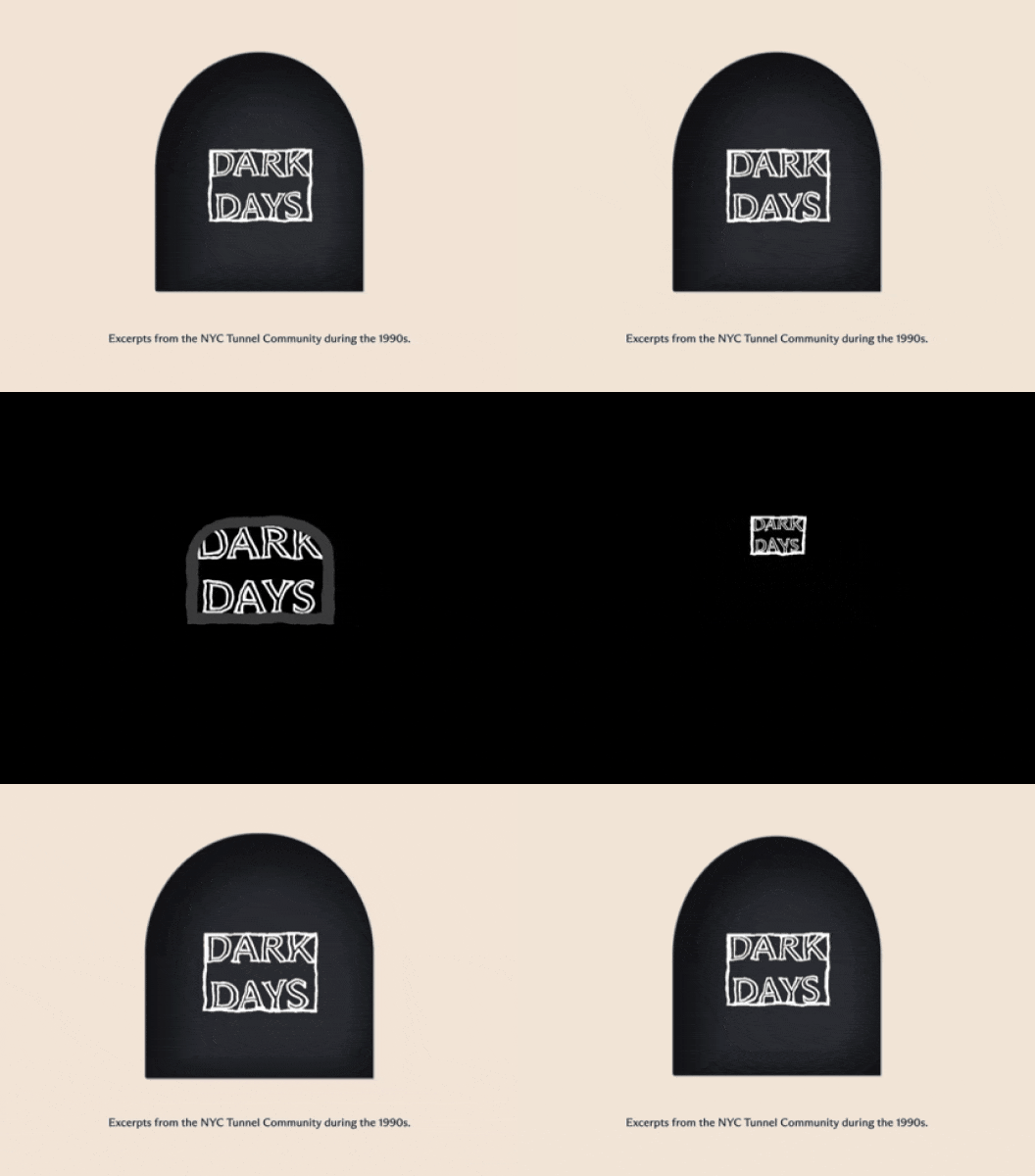
The website features an interactive scroll animation that invites users to enter the tunnel, thereby beginning their journey...This effectively sucks users into the narrative.

Interactive Component

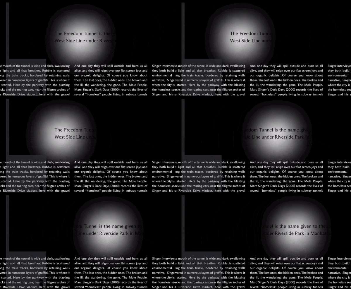
I also created a flashlight animation out of the mouse pointer, allowing the user to search the page for hidden pieces of text, (notable pull quotes from the editorial).

This experience is made to both highlight the impact of these segments, and also introduce a playful mystique. The experience parallels exploring the tunnel walls underground with a flashlight, in order to read graffiti.

Parallax Hierarchy

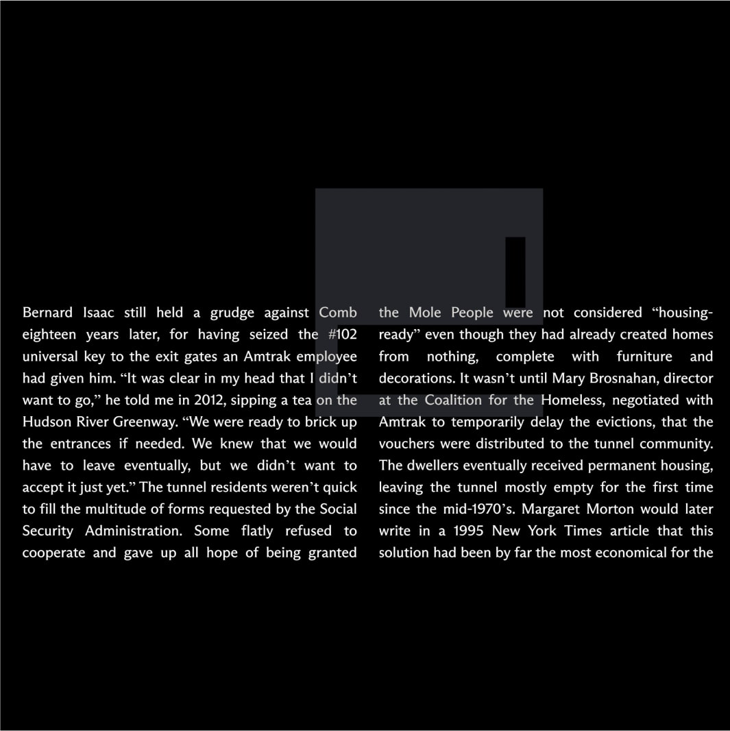
The letters h-o-m-e appear in graphic form and parallax scroll vertically behind the article content. The content hierarchy also stays true to its print conterpart.

Overall this web experience mirrors the physical act of exploring the tunnels, flashlight in hand.

Final Deliverables

Digital version of the Dark Days print broadsheet and corresponding website available to view: